While going through the principles of animation again and analysing examples of how they are implemented in films, we were tasked to take a scene from line test drawings from the film The Prince of Egypt and analyse how the characters were animated. The scene I chose to analyse was of Rameses’s father Pharaoh Seti talking. During my analysis of his movements, I specifically focused on aspects such as how he transitions between different poses and the smaller bits of his body actions that changes with each pose.
Monochrome – Final Animation
Planning and concept
For my final film, I wanted to create something that combines elements from all of the different tests that I had done. The idea that I had came up with was to make an animation that depicts anxiety. Because I had gotten feedback to make use of a medium other than animation paper since I had been using it for all of my previous tests, I decided to try creating shadow puppets instead. With this idea, I wanted to do something that also visually depicts a head like my Sound of Silence test. The idea that I came up with was to create a shadow puppet of a head of myself that would open up to reveal a monster or demon that is symbolic of negative thoughts or anxiety and is visually inspired by the Indonesian masks I got inspiration from in my last test.
Initial Test
To create my shadow puppets, I made them out of paper that I drew on and cutout using a craft knife and afterwards I put the cutouts on a light box over a rostrum.
The results of my initial test was very successful as I was able to depict the visual sequence I had planned out and I was successful in working with the shadow puppet method. The feedback I received for this was to continue experimenting with transformations and to try implementing the pattern animations I had done in my previous test.
For the final animation, I decided to add a walking sequence to make the animation longer as well as to have more visuals to play around with. I decided to have the character walking in the beginning and passing by rows of shadows staring at him. As he continues walking, the shadows increase in frequency as they pass by him. This is to depict anxiety and the feeling of being judged or perceived by everyone around you which results in overthinking. To show the shadows passing by, I planned to cut out a row of identical heads that would rush past the person as he was walking which would be a way for me to play around with repeating patterns as I had done in my previous animation.
To further extend the animation, I also added more to the sequence of the character’s head opening by having the character turn his head side to side to depict him struggling with his emotions. I also had him struggling to keep his head closed as the demon face tries to pop out and the demon face trying to keep his head open before he closes it again to show the conflict that he is fighting with his inner turmoil.
Final Film – Maelstrom
I would say the outcome of the film was highly successful as I feel I had done very well in making use of shadow puppets as a medium and properly depicting the story that I wanted to depict. I had gotten very positive feedback on the visuals and the effects it had on the story which I feel adds to the success of my final film.
Monochrome – Sound of Silence
Sound of Silence Test
For the Sound of Silence assignment, we were tasked with creating an animation that depicted our interpretation of what silence sounded like using audio we recorded with a microphone. I had the idea of recording the sounds of machines running as I felt that machines running by themselves without human interference was a way of interpreting what the sound of silence would be. So, I recorded the sounds of the washing machine room in my accommodation and the sound of a microwave running and the sound of the vents in my bathroom before settling on using the sound of a microwave.
Initially, I had trouble coming up with ideas on what to visually depict with the audio I had. The idea that I first wanted to depict was of a sort of thinking machine and I played around with ideas of a machine creating art.
With the idea of a machine creating art however, I felt that I was straying too far from the original sound of silence task and it was not going to become relevant anymore. So, I decided to rework the idea and instead find a way on focusing it on myself. I then came up with the idea to depict how our minds function sometimes independently of ourselves, having a constant flow of ideas and thoughts that are being created in the back of our heads, often with us being unaware of them. With this, I created an idea for an animation of myself that would have my head opening up to reveal a machine head that represented my inner thoughts.
The final animation was made using a light box and animation paper again like the previous tests. I felt this test was especially successful as I feel I was able to translate my ideas very well onto paper and I created a final product where the audio and visuals work very well together.
Monochrome – Animation Tests
Visuals Test
For this test, I was inspired by the magazines that I had taken pictures of during the Into the Woods assignment and wanted to create something that was influenced by graphic design elements. This test was done on animation paper and a light box that was used.
Materiality Test
For this test, we were told we could animate in any way we wanted as long as we began and ended with a square that was drawn onto the animation paper using a small metal square that we were given. Following making our animations, we would then combine it with the animations of two other classmates.
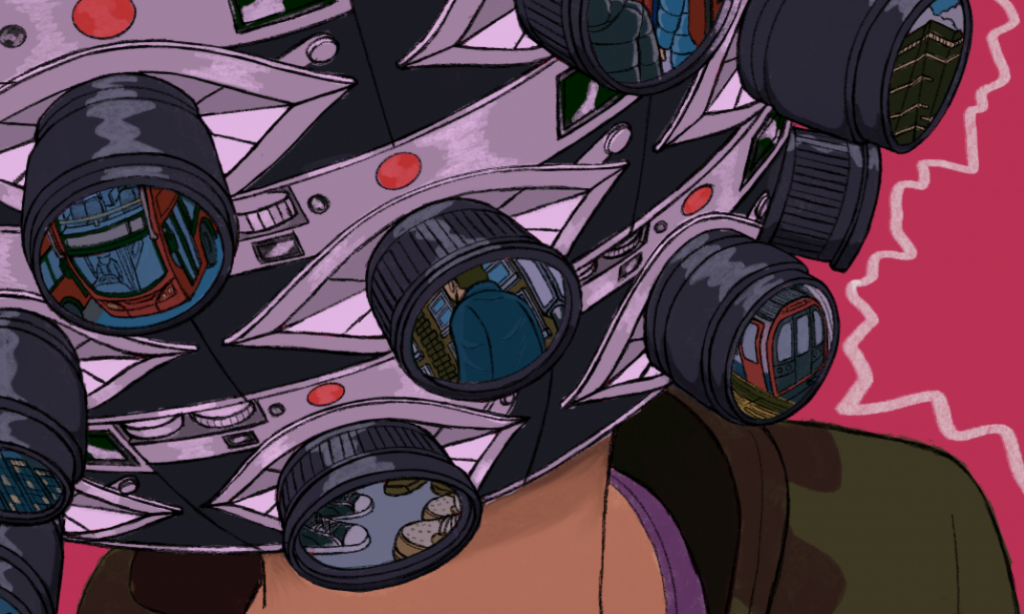
For my animation, the story I wanted to depict was that of an experience on public transportation and the feeling of being overwhelmed by the people you are on the train or bus with. The animation would begin with a square in the middle with a character of myself wearing headphones. Afterwards, other squares would emerge on the paper of different individuals on the bus or train that are making noises in some way and more of them would appear more frequently as the animation continued. Following this, the square with myself in the middle would grow larger to depict myself feeling frustrated with the people around me. The square would then grow to cover up all of the other smaller squares that had appeared before shrinking back down to the same size as it was at the beginning of the animation.
When combining my test with other classmates that I worked with, we were also tasked with coming up with a way to create transitions between our animations that would play with the materiality of the test. For this, I came up with folding my animation before unfolding it to reveal the next frame for the animation of the person after me.
I felt this test was quite a success because I feel I did very well to create an animation that worked well to transition seamlessly to the animation of the other people in my group and I feel I was able to create a test that was creative while still working within the bounds I was told to work in.
Flower Mask Test
For this test, I wanted to make an animation that was inspired by Indonesian culture, particularly Javanese shadow puppets and batik patterns. I planned on making a batik style flower that would spin in the centre of the frame and visually transform into a mask. Meanwhile, there would be rows of triangular patterns that would move vertically while the flower in the centre transforms.
This test was quite successful in playing around with visual elements, building off of the first test I had done which had tested moving around words and other graphic elements. With the success of this test, the next step was to find ways to take what I learned from these tests and transfer them to materials other than animation paper and light box for my final animation.
Lip Sync – Animation Process
In the first step of my progress, I began drawing my main key frames.
Between the first and second steps of my progress, a major change I included was the addition of more poses between the first and second flashback scenes where Kaya is initially talking to the camera. At first, I didn’t many poses aside from her having her hand out. However, I was told that she needed to have more acting and more time for her to have mouth movements. So I added an additional pose of her raising her hand to her head and I shortened the first flashback scene so that it would immediately switch to her talking after she says “no” during the flashback.
I also added more poses while she speaks at the end as I was given feedback that her poses were not exaggerated enough. So I redrew her pose to have her shoulders and hips slanted to be more expressive and I had her sticking her neck out as she holds her hands out to emphasise her annoyance with the situation.
In the third step of my progress, I was given feedback that she was still moving too stiffly so I added more poses to make her more expressive. I was advised to make her express more anger due to her being in the situation of having nearly had her phone stolen, so I decided to exaggerate her actions by having her leaning forward and gesturing to herself. I also added other movements such as her shrugging and shaking her head as she holds her hand to her head.
In the fourth step of my progress, I had finished with my key frames and began drawing my in between frames. To make the character movements smoother, I added arcs to the arm movements to help figure out what in between frames to add between key frames.
By the fifth step of my progress I had begun colouring the animation and I continued to improve my in between frames by adding a boil to the characters when they were standing still.
By the sixth step of my progress, I had finished drawing the in between frames and continued colouring the animation, moving on to the scenes where Kaya is talking in the present. For the scenes when she is talking at night, I created a separate colour palette at for her at night time where the colours are darker than her palette when she is in the day time in the flashbacks.
By the seventh step of my progress I had finished doing the base colours of the animation.
During the finalising of my animation, I refined the colours by adding a low opacity layer of blue lighting to make characters in the night scenes appear darker so that they look like they are in a night time setting. I also added further details to Kaya by adding her loose hair strand and the green eyeliner she has as part of her character design.
I further refined the colouring by adding blue lighting for the scene with the policeman and the robber so that the characters appear to be lit by the blue siren lights of the police car they are standing in front of.
Lip Sync – Pre Production
Story Development
When interviewing people, the question I asked to people was “What is the funniest interaction you’ve had or what was the most funniest experience that you’ve had in London?” which I felt would prompt more interesting responses from people. The audio that I chose was from an interviewee whose story was that she stopped a pickpocket from stealing her phone by catching him during the act.
Storyboarding
During the initial planning of the animation, the main scenes that I visualised were of the robber pickpocketing her raising his arms as he is caught and of a scene where it is revealed that the main character is talking to a policeman who has caught the robber.
During the storyboarding process, I intended the story to be an interview of the main character speaking that would have flashbacks to the robber that she is talking about before the scene would transition to a reveal of the policeman and robber listening to her story. Initially, I planned the animation to open with a scene of the robber sneaking up behind the main character before zooming in to his hand trying to reach to her phone. However, I felt that this scene would be too much to animate and instead, I changed it to a single scene of the robber behind the main character standing still which would be easier to transition to the next scene of the main character turning around to catch the robber.
Background Designs
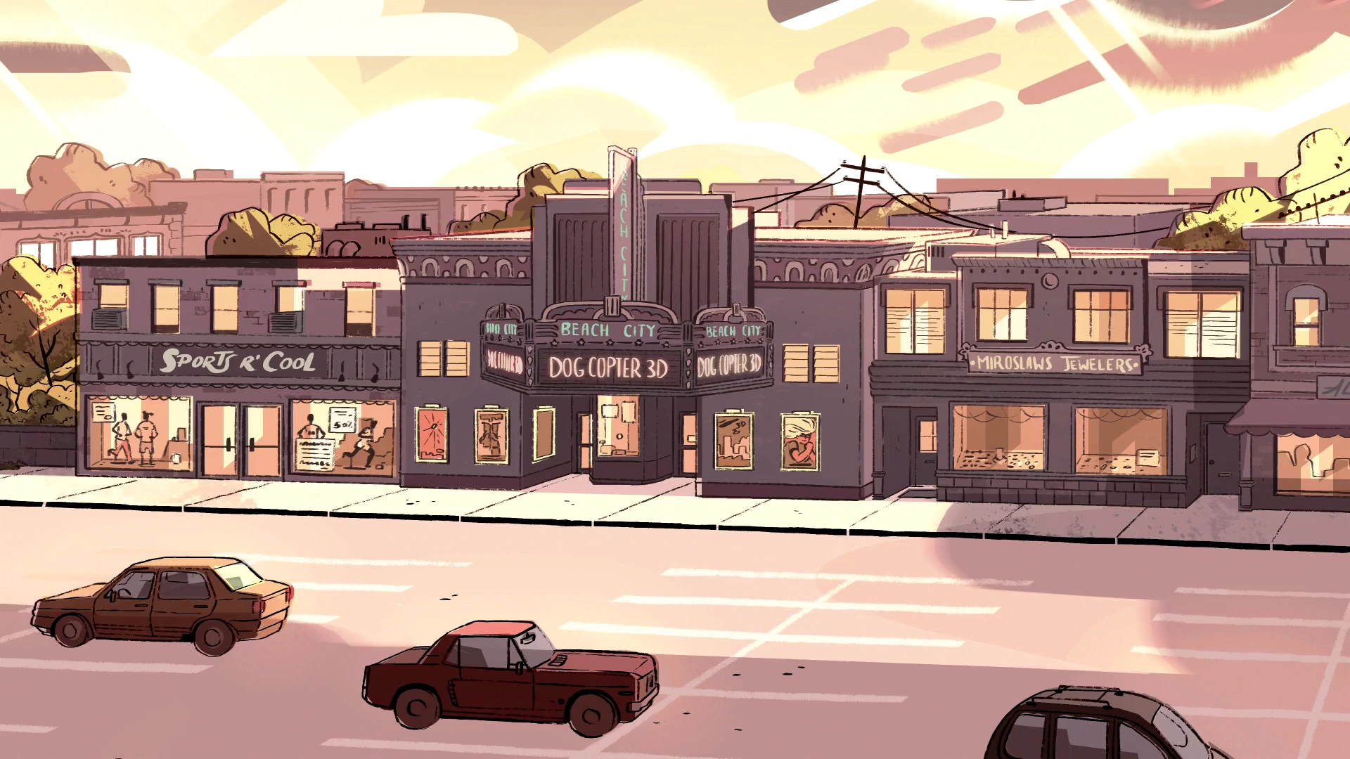
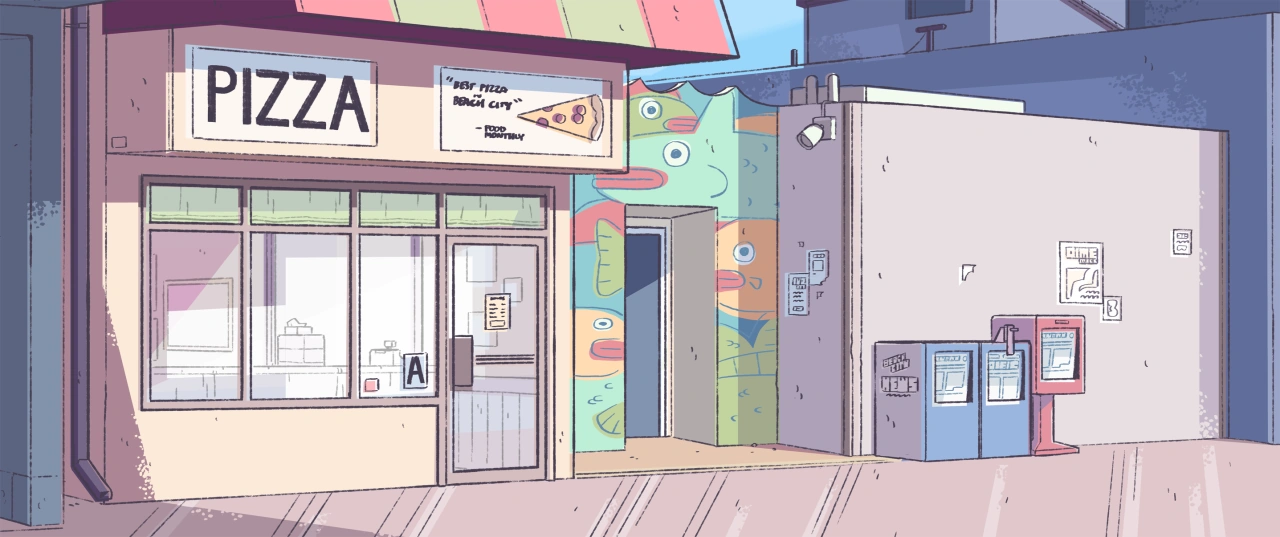
For the design of the backgrounds, I wanted the setting to be the average London street with corner shops and walls with graffiti. To design the backgrounds, I took inspiration from pictures that I took during walks in places such as Clapham.
For the art style of the backgrounds, I took inspiration from the background designs of the show Steven Universe, especially with the style of sketchy line art and lighting.
When drawing the backgrounds, I initially planned for every scene to be set during the day time so I drew every background as being set around the afternoon.
However, I received feedback that the scenes where the animation switches between when the main character is being interviewed in the present and when it is a flashback to when she stopped the robber were hard to differentiate and could be confusing. Because of that, I tried different methods to differentiate the scenes, such as potentially making the flashback scenes be in black and white or being coloured with a different lighting before I settled on making the flashbacks set during the daytime and the main character talking set during night time.
While colouring the backgrounds, I also did several tests with the character in the environments to see if they fit in well with the setting or if they contrasted enough or not, as well as to see how the lighting would be on the characters.
Other changes I made to the backgrounds following feedback were blurring parts of the background so that they don’t take away focus from the main character.
Character designs
Main character – Kaya
For the main character that is being interviewed, named Kaya, I wanted to go for the design of my character was that of a fashionable teenager or young adult with an expressive and sarcastic personality.
As the person I interviewed for my audio was Southeast Asian, I wanted to design a character that was of Asian descent. Thus, I looked to taking inspiration from the designs of characters of Asian descent, particularly Jentry Chau from the series Jentry Chau vs The Underworld, and the character Rinna from the series Win or Lose. I also took further inspiration from actor Greta Lee as an initial reference for designing the character’s face.
While designing the main character’s clothes I sought to give her a streetwear inspired aesthetic, particularly with baggy jeans and wide shirts or sports jerseys go give her a casual look.
For the initial design of the character, I originally had a more detailed design with elements such as a star and stripes on her shirt and details of pockets on her jeans. However, I was advised that these elements would make the character too detailed during animating her so I was advised to simplify the design further.
Robber
For the design of the robber, I had in mind from the beginning of depicting the robber in a stereotypical robber for comedic effect.
When designing his character, I sought to find ways that incorporated elements of his design in interesting ways, such as having his mask and hat merge together and have the line of his cap function as his eyebrows. When designing his body, I wanted to depict him as a sneaky robber so I designed him with a lanky body.
I feel that his design was quite successful in having an expressive character that communicates the robber’s personality to the audience. I also feel that his design is a good contrast to the police officer’s design as his lanky design contrasting with the police officer’s stockier proportions would help to depict the difference of power between the two.
Policeman
Designing the policeman, I focused on making his design accurate to the uniforms of what London policeman wear to make both the character and the setting recognisable as being London.
While designing the character, I used actor Omar Epps as a reference when drawing his face and facial expressions. When designing his body, I looked at examples on how to exaggerate his body proportions to give an air of authority or power to him, using character designs from Teenage Mutant Ninja Turtles Mutant Mayhem as reference due to their characters having exaggerated proportions. Thus, while designing the cop, I focused on having him have a wide and stocky torso to give him an imposing figure, and I gave his head angular features to make it more expressive and have a more interesting shape.
X Sheets
X sheets done for the mouth movements in the animation